Sunday 23 November 2008

its peanut butter jelly time!

minus the jelly, aint got no jam,
whilst eating this highly arousing delight il be watching top gear. 
I bid you good night.

postman pat and his black and white cat

week 7/8,
Taking the recession opinion/message further, then given a brief to produce a mail shot which distributed this message. 
Again i had two main focus points, Bond and birmingham, with this in mind i straight away sketched some designs for what could go in and what the envelope could look like, having a bond theme whilst promoting Birmingham. 


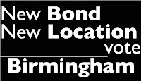
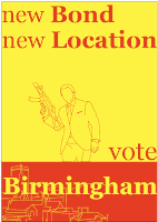
It was during this process that i came up with the idea of creating a national vote in the UK which let the public vote for the city they want the next bond movie to be filmed in. 
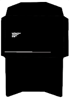
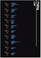
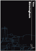
Progessing with ideas and several designs i eventually ended up with final designs for the envelope, mailing list and contents of the mail shot...


overall i think as a series, the mail shots work very well, its minimal and somewhat elegant keeping in with the Bond theme, it clearly states the message i have created and furthermore is interactive with the target audience which i don't think was a common occurrence with other peoples designs. 
it is nice.

The Guardian newspaper is about news. on paper.

Week 6.  No News Is Good News. unless its because everyones dead. bugga. 
This project is in two parts, 
Firstly we had to choose a quote from a selection of articles in the paper, 
We had to research the topic the article talks about.
I chose the article that was based upon the scary-wary recession.
........i did some research...It was nice........
From this act we had come to our own opinion on the matter.
After finding the headline;
 
'If credit crunch goes on, next Bond location could be Birmingham' 

having the honour of coming from Birmingham i ran with the headline that was a quote from Mr Daniel Craig himself. Coming to the opinion... 'Bond Should be in Birmingham' 

second part;
message and interpretation 
From here I had to create 3 count it 3, the magic number and all that jazz, impact posters.
i had two things to concentrate on, Birmingham and Bond. 
after collecting images and also looking at political posters i came up with 3 designs which followed the mandatory requirements. 
These are the final 3 designs;


I was fairly pleased with the outcome, i had been away during the handout of this brief so i had quite a short time to come up with the designs. Furthermore as it was my first idea and it actually worked and looks half decent, surely thats credible! I'm quite evidently a bloody genius. obviously.  

A bit more orange. 'citing.

Week 5 now, what is your colour?
Colour = orange
After brainstorming on what is orange to me, words, objects, phrases etc that to me relate/show/is orange came to the conclusion that the answer to the question, what is orange? is...
'Orange is a Fruit' 
reason being, we got the word orange from the fruit, then gave that word to the colour of the orange, orange. How many times can i use the word orange in this without it becoming ridicularse? 
From finding out what orange is to me, i started to bash out design ideas that represent the answer, what is orange? 
so each design must be based upon fruit, even more so, the orange fruit.
10 designs done.
Here are my fave...


The crit we had for this project went as the french say,
'very badly' 
I was criticised firstly because i didn't have 10 designs at the time I only had 7,  I knew this.
I was criticised because the answer to the question was too obvious. well thats what orange is, it is a fruit, it is a colour, it was a fruit first. Why go into some obscure way to show orange, which at the end of the day may show what orange is, but is taken so far that you then have to explain what your trying to portray, which is rhubarb and deems it to not work therefore, the work is a failure. 
I knew and admit that this was one of my weaker projects, i didn't enjoy it, and the majority of my designs i wasn't fond off. 
However having a crit which told me something I already knew was just a waste of my and everyone else who participated time. Furthermore I was questioned when i objected to the crit and asked why i bought in work that i didn't like or think was any good. This is hilarious, next time i don't like my work and we have a crit, i just wont bring anything in and simply state, i didn't like it. All in all this was a low point of the course. 


orange and stuff

We had a colour workshop, it was nice. 
We had to collect 10 objects of a given colour, it was nice. 
My colour was orange, it is nice.
I had a range of orange objects, they were nice. 
As a group we gathered all of the orange objects, it was nice. 
we took photos, they were nice.


the whole thing was nice.

can i get a re-wind!

Its deadline time, so lets do my blog. Starting from week 3, project given; design a typeface which shows your partners personality, partner=Kay, aka turd.
After discussing the problem at hand we decided on 5 words that i would focus on that best reflect her personality, 
. Weird 
. Deep
. Positive 
. Special 
i went away, chose a font to base the typeface on = Chaparral pro, and started playing about with ideas. 
I chose to split the letters of the alphabet into the 4 words, therefore having 4 continuing styles of font. 
This was the end product... 


(i realise the whole alphabet isnt there, get over it) 
(Also this is the typeface after tracing it on illustrator)
I was quite pleased with the final designs, compared to everyone else i was the only one really to show each personality trait with a seperate design, rather than show numerous traits with one continuing style. I was happy, kay was happy. so nerhhhhhh.