Tuesday 24 March 2009

communication=virus

So this new brief, unfortunately due to missing the monday on which this new project was given, subsequently missing out on forming a pair, i only started a few days ago! Me and my newly found partner mille, had no choice and jumped head first into one of the tasks set. 
We chose the problem, 

Get people to talk to communicate more  

I had very shortly looked at this list already and came up with an idea for each task. The idea i had for this specific problem was to create a mobile phone tariff which gave people free minutes with which to talk to their friends and others with! What we'd be producing would be a sort of promotion/ ad
vertising campaign for the tariff. This getting people to talk more as w
e are giving them free minutes to use on mobiles.
Anyway with the shortage of time we just went with this idea and started to research into several mobile companies to look at what offers they do and what kind of adve
rtising they produce etc 


Again with the pressure being on us in
 the form of time, we had to quickly decide what we were going to do, firstly we had a choice of,
a) Creating our own mobile phone com
pany, and within this creating our own tariff
This would be more original however more time consuming. 
b) The other option would to use an already existing mobile phone company and merely promote their n
ew tariff of 
free minutes
This may be seem as a bit of shortcut and also restricts certain design elements, but in this instan
ce that may not be a negative thing. 
After a quick talk to one another, me and mille decided to use a pre-existing phone company to host our promotion and advertising campaign. 

The next stage was to choose an existing mobile phone company. During this decision we recalled the restricted colour palette(2) and it came to us that orange mostly uses two colours, black and orange.
So Orange it is! 

From here and looking a little
 deeper into Orange, 
i remembered that they use animal names and icons to represent their different tariff plans. So we needed an animal which could be linked to the notion of talking. 


We thought about it and the only thing we got was a monkey, but that wasnt right for the job! I asked a few people around the studio and finally got the answer parrot! genius the only real animal that like talks to humans, kinda! 
So we had the general principle and the basic imagery sorted, 

The main decisions that were left was how we were planning to promote and advertise the campaign, so pretty much the main thing!
Monday 16 March 2009

How to... Package 2

So now it was a matter of playing around with the layouts and size of the designs for the package, 


After this process i went on to get it down to about 3 final designs...


Its the front of the package that has caused me trouble, iv been finding it hard to choose a final one, so i asked a few peoples opinions and the majority have said they prefer the top far left. So this is the one i will most likely be using in the final package.


This photo just shows the format of the sleeve, folds two ways to form a somewhat book shape, slips inside the package over the tee, like so....


How To... Package

I've yet to find a format to present my t shirts in a way that supports the informing of how to be a proper guest at a party. 
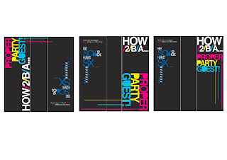
After coming up with a number of design solutions, i have chosen to create a package in which the shirt will be folded into. I also know that the package i am using is what i got the plain white t shirts in, a clear plastic wallet, which has a cardboard sleeve within. It is this cardboard sleeve that i shall be designing. 

Here are a few designs for the front of the package;
 
The main purpose for the package is to explicitly state what the t shirt is doing, so i already had the logo or brand name sorted with, 'proper party guest!" Aswell as this i need to some how get on the package this is how to be a proper party guest. but i cant just put it like that, would look naff and wouldnt be appropriate with the t shirt and the idea of it being modern, young high street fashion.  
I eventually came up with making it into this abbreviated phrase, of how to be a = how/2/b/a, this relating to this 'text' youth with inproper vocab and a low grasp of grammar as i show all the time on this darn tootin blog. 
It was just a matter of experimentation of layout, size and colour. Although colour is limited as only a few things will work and match etc
 
And here's a few designs for the back of the package, this obviously doesnt have to be as eye catching as the front however i feel it does need some thing.

I tried taking part of the design off the t shirt onto the back, then i tried showing a diff t shirt for people to buy with the other message, Be Sick and Have Sex!
Out of them all i prefer the simplicity of just having the other design. But only when the colour of it is the same as the colour of the t shirt within the package! 
Now to just put it all together into one thing.

How To.. Logo Design

Within the poster/t shirt design i included a kind of brand name to the t shirt, mimicking  the designs on t shirts made by Gio Goi and Beck and Hersey. 
To make it relevant to the problem at hand i simply put 'PROPERPARTYGUEST' having the 'proper' a different colour to the rest (matching the design on the tee) So i played around with making this into the brand name for my t shirts, and like most brands within high street fashion they have a fancy logo. 
Here's my designs for this!


With these designs i was focusing on keeping it visually exciting, something short sweet and effective. I looked into club night promo flyers, which are made to attract a students eye, looking at layout, colour and what not. Within one was the use of CMYK, however the colours werent as bright as they could have been, so thats what iv done! used CMY creating a young, fresh neon colours!
Out of this lot im starting to prefer the 3 lined, aligned to the right. keeps it simple, easy to read, keeping it simple is the key i believe!

How To... T-SHIRT

Heres a cheeky glance at one of two t shirts iv made, 


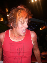
Here we have Marc Redhead, a typical student, after a pint or 12 and a bag of pills he decided to put my t-shirt on and dance around the living room. 
It was 3'o'clock in the afternoon and there wasn't any music on. 

To make it i just bought some t shirt transfer paper, printed the design on and ironed it onto the plain t shirt.
Aswell as this i have a white t shirt with the blue and grey colour message! 
I think they turned out quite nice, the problems i have with it is the size of the phrase, i could only get a4 transfer paper, and also it gives quite a plastic shiny finish which was unwanted! With more time/ thought and teaching id like to screenprint the design into t shirts, this way i  could print onto coloured tee's not just white and expand the size!

How To... 2

Aswell as the variation of colour i thought id think of another phrase...


Act 2, 
Be Sick and Have Sex
Surely a must at any party!

How To... posters

                                
This is just a exploration of colour! I reckon they made rather dashing posters, Just adds to the t shirts, maybe as an ad campaign, see that ad get it on a t shirt! 
And in action, 


can you spot it? 
out of the colour prints this came out to be the most vibrant and bright, therefore being the mot eye-catching. The only thing that hinders it as a poster like this is the size of it, I reckon if it were A2 it would be better, grab the eye quicker than this one!

How To... develop

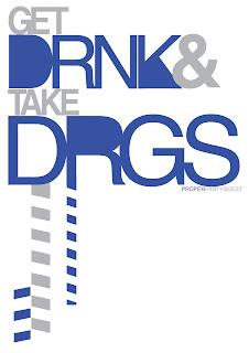
Little bit more progression with the drink and drugs message, 

As i said the problem i found was that the phrase 'DRNK&DRGS' wasnt enough on it's own, as it sort of fell short during the crit, it needed something more, just something else to put into the context of informing my audience how to be a proper guest at a party! What is my message; be a proper party guest, get drunk and take drugs! so, what i did was do my best to say this, but keeping this high street fashion style!


I think this is the better of the two, bit more stylish and neat, finished of with the slanted boxes, in the style of Gio-Goi, Beck and Hersey. Furthermore, with the added 'get' and 'take' and what i will make into a logo or brand name, 'proper party guest' its out into a stronger sense of the context i am aiming for, however it is not yet fully there! This whether it be a t shirt or a poster needs something to go with it, something to really define what the message is answering to! More work then yeah...

How to... 1st designs!

I've been playing around with a few things, banging out design sheets, making up little phrases, creating some draft posters of something that i could develop,  these are just some of the more visual ideas i have produced from these designs...


I think iv found something with the DRNK&DRGS logo thing! i got the idea from looking at mainstream, high street fashion (something that relates and is appropriate to me target audience) focusing mainly on two brands, Beck&Hersey and Gio-Goi. 
Theres still a lot to be played with though, firstly the colour schemes, i think the best move to begin with that is to steal the colour schemes from the t shirts made by the researched brands. Aswell as this, the message given is a little unclear, some may read drink others drunk, and on its own as it is its not apparent that i am telling people how to be a proper guest at a party! So i be needing to work on this...


How To...

Sum up a students party with one word,

From asking this question to me fellow students i got a list of words that could describe a typical students party. With the list i shortened the words down to just a few, 

Drink- alcohol, getting drunk etc
Drugs- chaos, mayhem etc
sex- pullin etc
sick, dance

Here i reckon i have the key points to my content for my products and what not!  
So i'm off to have a play around with making a message/phrase with these words, brb.

Sunday 15 March 2009

How To... Initial ideas

After identifying the audience i had to think of what young typical students respond to, what they see, read, watch etc! One thing that i thought of was general main stream media! obviously a very broad and vast term, but things that are visible on a daily basis, the ads on side of buses, phone box ads, popular tv, magazines. 
So i need to get thinking of something that would be well suited for mainstream media that the everyday person would stop and look at. Something to catch the eye like. 

Couple of initial ideas, 

- own version of mastercard ads, 'priceless, for everything else theres mastercard'
Having like a list of, 8 pack of beer £6, vodka £9, Class a drugs £5, taxi/kebab/ etccc being a proper guest at a party, priceless! 

- Facebook group 
Creating a facebook group, giving rules on how to act/drink do etc! Fits in with the ridiculous new age facebook addicted populas! 

- T shirts
Think of a slogan, or short catchphrase that sums up what to do at a party, to wear generally, at a party informing the wearer and other party guests what to do! 

i went off to briefly play with some of these ideas, see if anything clicks!

HOW TO...

I'm a bit behind with the blog i apolagise, but i've been making some hot shit!

How to brief...
i chose number 678, i think, i could be wrong but the problem was,

How to be a proper guest at a party. bingo. 

I consider myself pretty lucky with what i got, in my eyes theres a lot of potential! 
First thing  i had to come up with was the kind of angle to tackle the problem. In my eyes i had two, do it all serious and that for people who are actually concerned about acting all proper at a party! or not! 
I chose not. Next what kind of party we talking about? birthday? house? etc 
With all this in mind, i was also thinking of how i was going to tackle this, I knew i didnt want to produce a leaflet or a simple dumbies guide to kind of thing! Something that was in the back of my mind due to previous ideas for the recognition brief, was to produce shirts or a range of! 
Looking at it like this, where i wanted to produce something a bit more exciting than a pamphlet i needed to think of a target audience that would see/react to something like that!
I figured young people ranging from the age of 16-25, who most of which would be students. 
Audience; age range 16-25, typical students

With my audience decided i wanted to come up with what message/answer i was going to putting across. How to be a proper guest at a party. for students! What do i do at the parties i go to, i get messed up! drink, dance like a hero! 
Thinking about it, everyones aware of this general stereotypical view that young people/students at parties just get drunk, take drugs, have sex(unprotected?) especially with the programme Skins portraying this exaggerated young lifestyle, where everyones pilled off their tits, drinking and necking with anyone next to them! Brilliant! 
So im thinking this is the angle il be taking, saying that to be a proper guest you must, drink alcohol to get drunk possibly a bit of sick, take drugs, have sex with strangers, lovely stuff! 


Thursday 12 March 2009

Recognition Day, final choice

After the crit i finally chose, 


The reasons for choosing this design are, firstly it was the one that was chosen by most of the critics to enter, i also like it myself, light hearted, fun, cheesy! 

Monday 9 March 2009

Recognition Day, final choices

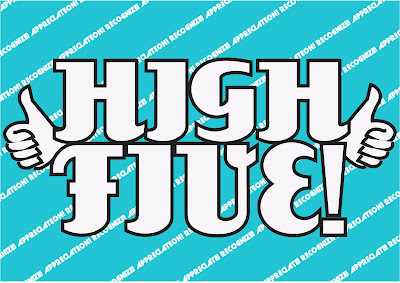
So i played around with 3/4 different designs, varying with all sorts of layout, font and colour etc and i've come down from 5 to 3 final designs, one of which i shall be submitting,


What i wanted to keep consistent through the different designs, was the in your face colours, which some people may deem as being cheesy. Obviously i like all three designs, i think each one is tackling this 'cheesy' issue in a different way. The top picture has this home made sort of 3D feel and for me the colour scheme is reminiscent of what was deemed hip and cool in the 80's!
The middle is loud and bright, in your face! With the thumbs up just adding that little bit of what i like to describe as a typical 'cool' dad thing. The third takes its inspiration from the one and only Borat! with his saying of HIGH FIVE! GREAT SUCCESS! my wife she is dead! nice! and all that jazz, genius. 
Which one to enter? 

Sunday 8 March 2009

Recognition Day, development


i took this one design and tested it out with a load of colour variations. Looking at this way gives me a good way of seeing what works better! personally I'm liking the bright coloured text on black background, for me it just stands out more than the others, and i guess due to its simplistic or minimal aesthetic it can be taken as cheesy, along with the message, HIGH FIVE! GREAT SUCCESS!
If i had to choose one of these, black and neon baby blue! 
( I have also done this for other designs but having technical difficulties with changing size and converting to jpeg)

Competition, Recognition Day

...Sorry to be naughty of late Mr Blog, i still love you.

 
First brief given to me after a more relaxed week, enter a competition, RecognitionDay or DontPanic! 
I chose to enter the recognition brief, due to the money incentive, i is well poor blud. 
What is recognition? dictionary please. 
Design sheets were made, focusing on this question, from this i basically kept in mind what Recognition Day was actually about, one thing that came up numerous times was the notion of just saying, 'Thank You' which is a way of showing appreciation, bang! there was my answer for the brief, recognition is simply appreciation! 

concept statement

message 
Simply put, show appreciation to others! Thank You! 

What do i mean by this?
I want to just promote the notion of appreciating others, particularly on Recognition Day. 

Who? 
UK males/females roughly aged 16-70, relates to everyone, the Recognition day itself is aimed at every bloody person in the UK. 

Content? 
Short messages, slogans, type!  

Produce minimum of 30 designs, now! 
I bailed at 30 tbh, but i did find the task of 30 designs helpful, it makes the whole thing seem a lot more open and broad than it looked to begin with. 
(place photograph off design sheets)
With this there were some clear ideas with a lot of potential and others which were rabbish! 

CRIT
I had a crit, it was nice. 
Gave us the opportunity to pin up some of our better and worse design ideas and talk about where I'm going, what i think works etc!
During the crit i was simply looking at my ideas and one just instantly made me smile! 
                                                           
Its a humerous way of recognising appreciation, with Borat as a modern day reference, and the well known phrase of 'HIGH FIVE!'
It came to me from this, that my design should really make people smile or atleast happy, which goes hand in hand with the whole Recognition Day thing! 
So i talked of this idea in the crit, and fred mainly seemed to like how it's just really cheesy, and i should do my best to make it as cheesy as i can without making it look awful!
So cheesy, i needed the cheesy way of saying thanks/showing appreciation like high five! and it needs to visually be pure cheese... 


From the crit i went away and started to produce what i saw as being cheesy, the message on the poster, layout and colour shceme. I found it pretty difficult to make something look cheesy without it looking shit. I still don't know if thats even possible to do.
At this point i know i want to use one of these phrases, High Five! or Thanks a million!
Im not so sure about, Great success! think the relation to Borat may be inappropriate and not really needed. 
I must go forth and experiment with all the phrases, with every layout, every colour! and any additional shiz i deem necessary.