Speaking from experience 16!
14 years ago
What skills have you developed through this module and how effectively do you think you have applied them?
During this module i feel i have developed in different areas. Firstly i feel this is the best iv performed all year, carrying on from what was overall a positive module before this, keeping the work flow going and commitment going. From this i feel i have developed skills within time management, and more specifically making most of what time i had, creating more work than i previously thought possible in short amounts of time. This being most effective within the earlier briefs as they had 1 and 2 week deadlines.
I have also not just developed but learnt a lot from the type and grid module, developing on the layout of my work and designs in general and learning about kerning and leading, of which i had no prior knowledge. I believe i used this fairly effectively within my three double page spreads, however i didn't experiment largely with them, using pretty much the same Pt. size for the leading and kerning etc throughout them. This being something i hope to do the next time i have the chance.
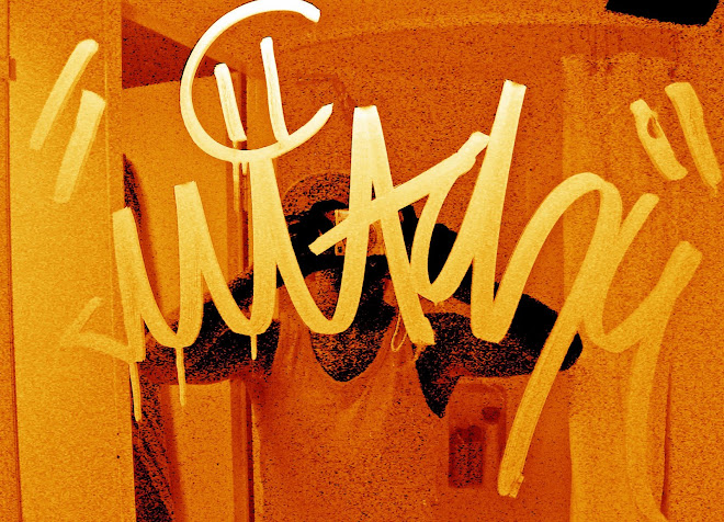
I have also developed some skills within the world of print. The print room isnt my best friend but im glad i chose to screenprint for the first time, so now i feel confident with how to actually screenprint on my own and am eager to use the process again as from seeing around the studio i know what the possibilities are within this method of print. As it was the first real time i had done screenprinting i wasnt really confident, and i did leave it a bit late so i didnt use it to its full potential, I also wish i had screenprinted the tee-shirts i made for the How To brief.
What approaches to/methods of research have you developed and how have they informed your design development process?
During this module i've actually looked into existing work and design that relates or coincides with my own work or what i plan to do. Thus informing my own design process on how existing products are effective and bringing that into my own work. Specifically for the last brief, i spent what felt a long time on research and very short development on ideas which lead to me changing from one idea to the other which i had never really done before, this helping me show that what i was creating was the most appropriate choice for me.
I also for the first time organized and presented my research clearly and cleanly by buying a cheeky folder thing. This informing my design process as it made it very easy for me to see where i was and what the next step was as my work was all linear.
What strengths can you identify in your work and how have/will you capitalize on this?
One thing id like to think is that my work is fairly different, comparing it to others around the studio, As far as i know i think i was the only one to create a load of stickers for the last project and maybe the only one to create t shirts for the How To brief, capitalizing on this would be to just keep being all different!
Another strength i feel i have within my work is the amount i can produce within a short time, this being very useful within shorter briefs as it allows me to work at quite a high pace without it feeling so.
What weaknesses can you identify in your work and how do you wish to address this?
I think one weakness i have or is in danger of becoming a big problem, is that the work i produce is all quite 'samey', i feel dependent upon illustrator and cant help but keep on using helvetica. I think the problem i have is i feel time is always against me and illustrator just feels a quick way of producing something that looks all proper in a short space of time. To address this i may just ban myself from using helvetica for a project or two, and for not using illustrator, im not overly sure on how to address, but when i get a brief try and think of something i can make or design without using fully depending on illustrator.
Another weakness i feel is that my work all tend to be in the same form of computer printed and i dont experiment enough with different forms of media. To address this i feel i just need to really think of ways aswell as computer printed to make a final product out off and generally just be more playful and open minded when thinking of media, form and even things like size.
Identify 5 things you would do differently next time and what you wish to gain from doing this?
1. I would screenprint any t-shirts i make. gaining a much more professional and respectable finish.
2. I wouldnt fail my print elective, twice, gaining more time to work on the projects for this brief.
3. I would work and experiment more with different media, playing with the format. Achieving a more thorough body of work and development.
4. I would have done more than one screenprint for my last project, more experimentation with. Getting a possible better outcome by comparing different designs etc
5. I would have kept my blog fully up to date, Not having to do a lot in one sitting, catching up.
How would you grade yourself in the following areas:
5 = Excellent, 4 = Very good, 3 = Good, 2 = Average, 1 = Poor
Attendance - 5
Punctuality - 3
Motivation - 4
Commitment - 3/4
Quantity of work produced - 4
Quality of work produced - 3/4
Contribution to the group - 5
 What i wanted for the typeface was something nice and clear to read, but something that looked quite digital and slick. Aswell as this i wanted to find a typeface that represented neon tube lighting!


 These designs are some ideas for the side of a bus, only using the strip in the middle of the two floors of a double decker or the one below the windows on a single bus! Again using the same things as the phonebox designs, just in a smaller format! At this moment in time i really like the black and cyan colour scheme within the phonebox, i need to take that to the bus designs, out if which my faves atm are the bottom left hand corner, the thinner strips, nice and simple, No blank space lost.